Eval from hannahsweeney6
Thursday, 7 March 2013

Monday, 4 March 2013
final product
Front cover:

I have kept to a conventional layout of a front cover with the main cover line being in the centre and the other cover lines surrounding the cover star. I decided to do this because I wanted to make my cover star and main cover line the main focus of my cover as my research shows this is what my readers think is the most important thing. I edited out the background of my cover star image using Paint.Net because after looking at similar magazines to mine I noticed most of them did this. I created quite a few mastheads before deciding on this one as I wanted to be able to choose from a few ideas. I decided on this one in the end as I liked the fact it had colour in it, as this would enable me to have an on going colour scheme.
Contents:

This is probably my weakest peice in my opinion as I think the fonts are a bit too basic, so if I was to do this again I would spend more time finding apprioate fonts. I do think the layout resembles a real magazine, as I tryed to make it basic and easy to understand. I like the picture of the male singing as it is a real picture of a concert, I think this shows a varition to the other picutures in my magazine.
Double page spread:


I have kept to a conventional layout of a front cover with the main cover line being in the centre and the other cover lines surrounding the cover star. I decided to do this because I wanted to make my cover star and main cover line the main focus of my cover as my research shows this is what my readers think is the most important thing. I edited out the background of my cover star image using Paint.Net because after looking at similar magazines to mine I noticed most of them did this. I created quite a few mastheads before deciding on this one as I wanted to be able to choose from a few ideas. I decided on this one in the end as I liked the fact it had colour in it, as this would enable me to have an on going colour scheme.
Contents:

Double page spread:


I think this is the best part of my project, as I particually like how the photos came out. I like that the reader can see the different sides of her personality which will make the reader feel as though they know her. I kept the 'Selena' font the same as the front cover as I wanted to keep an on going theme. I kept the interview chatty and informal because my target audience are quite laid back people.
Friday, 8 February 2013
making my improvements
After having my peer assessment feed back I decided to change bits of my magazine accordingly


Another improvement mentioned was to add page numbers on my double page spread so I did this:


I changed the Selena to the red like suggested and I think it looks good as it adds more colour but still fits into the colour scheme. However I think having all the main cover line in red is a bit to much red and stops the Selena from standing out as much, so I decided I should change the "ill never play the game" to a different colour.

I changed the background to black because I wanted to keep in with my strong colour scheme (black gold and red) because this is a strong point of my magazine according to my peer assessment.
By changing the colours around the Selena will be easily read, which is important as my research shows that my target audience buy the magazine mostly because of the cover star.
Another improvement mentioned was to add page numbers on my double page spread so I did this:


I made the page numbers red to link in with the colour scheme and they are also quite small and in the corner of the page as this is how they usually are in magazines.
I changed the Selena font as it was slightly blurry and some of the S was cut off. This is the new font

I prefer this font as it looks more pop as its more simpler. After re looking at my old font I do think it had an urban feel.
I also changed the font on my double page spread as I wanted to keep a consistant font.
Thursday, 7 February 2013
first proof
This is the first proof of my project


We peer assessed each other work so that I could have feed back on what was good and areas I can improve on.
Good aspects:
The colour scheme was mentioned quite a lot they thought it was very strong and was good how I continued it on throughout the different pages.
Another thing that came up a few times was the pictures on the double page spread they thought they had good attitude and where unique. On a whole they thought the magazine was quite simple but worked well this way.
Improvements:
The only improvement I got was that they thought it was hard to read the Selena on the front cover, they suggested I could change it to red to fit in with the colour scheme.
Another small improvement is adding page numbers.
Tuesday, 5 February 2013
Tuesday, 29 January 2013
Reviewing spelling and grammer
As I am now coming to the end of making my magazine I decided I would go through and check spelling and punction and little things like that to ensure it was all correct as you very rarely see this type of mistakes in magazines.
After going through and making some changes I then asked a peer to look through it for me so they could also check if I had made any mistakes.
As far as I am aware all spelling and grammer should not be correct.
After going through and making some changes I then asked a peer to look through it for me so they could also check if I had made any mistakes.
As far as I am aware all spelling and grammer should not be correct.
Friday, 25 January 2013
interview layout
My second half of the double page spread is the interview, I wrote the interview out first then had to put it in columns for my magazine. I originally started putting each question on the page separately, this is how it looked:


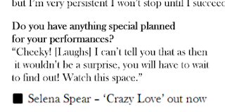


Although I hadn't finished putting all the text in I realised that the column down the middle will not be very big if I do it this way and probably wont be very straight, I also noticed that the questions where different sizes as I found it hard to get each question sized the same. So I decided instead I would put it in columns on word first then copy the text in

I now have a bigger column that it straight all the way down and the size of the text is all the same. However I did have to cut out some questions from the original interview I posted on here as it would not all fit in.
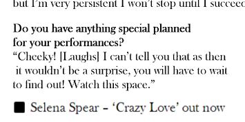
I noticed that at the bottom of interviews in magazines at the end of the interview they would state if interviewee has a current single/album/book/tv show out. Like this interview with Taylor Swift in Cosmopolitian

On my contents I have Selena 'Crazy Love' on my UK Top 20 so to link the two together I put it at the end of my interview.
Thursday, 24 January 2013
peer assessments
I asked some of the class to peer asses my work so fair to help my improve it.
The possitives of my work so far seems to be the colour scheme choosen (gold red black) they think its very strong and reflects my pop target audience. They also liked how I linked the colours of the mast head in with the front cover. Another possitive was the layout of the pictures on the double page spread, one said it was 'young and modern' which is exactly what my target audience is.
After hearing this is makes me feel possitive about my work.
They also gave me some improvements, they noticed I had miss spelt Rivalry on my front cover:


The possitives of my work so far seems to be the colour scheme choosen (gold red black) they think its very strong and reflects my pop target audience. They also liked how I linked the colours of the mast head in with the front cover. Another possitive was the layout of the pictures on the double page spread, one said it was 'young and modern' which is exactly what my target audience is.
After hearing this is makes me feel possitive about my work.
They also gave me some improvements, they noticed I had miss spelt Rivalry on my front cover:

So I went back and changed this as it is essential that I spell everything right.
They also commented on my contents page

Although this is unfinished they said that they think there is going to be too much white space and the section where the text is may look to bare. Somebody also commented on the font used as they though it looked a bit unprofessional. I had used Ariel Black to keep in with the front cover. However looking at again I agreed that maybe the font choice could be re looked at.

I then added more articles into each section to fill up the blank space, I also thought this would make it more realistic as magazine have quite a few articles in each section. I also changed th.e font to a less bolder one so I though this worked better but still fitted in as both my front cover and contents has thinner fonts on it. I also added a gold background the the section titles as this links in with my colour scheme which people seem to like. I also thought it would break up the white background.
I then thought maybe I could do something at the top where the contents is to stop it looking bare:

I put a blackground behind the 'contents' as I think it breaks up the white space which was orginally at the top but still fitted in with my colour scheme.
Thursday, 17 January 2013
Change of contents page layout
My orginal draft for my contents page had my cover star featuring on it like this:


However after doing this I realise there is now not enough room to have the articles that will feature in my magazine on the contents and the main purpose of the contents is to inform the reader about the articles that feature in my magazine. So I have decided that it would be best to not put the picture on the contents page and have the articles in the center of the page instead.
I am going to base my new contents page layout on this Billboard contents page:

The main difference will be that I wont have the picture in the middle as I want more room for the actual articles. I will also have the small pictures at the bottom. I like this layout as it is simple and easy to follow.
comparing my front cover to a billboard front cover
I decided that I would compare my front cover with a Billboard magazine as this is the type of magazine I am basing my magazine on.

Although the layout is slightly different it will still give me an idea of wether I am on the right track.

This is my front cover as it stands.
After looking at the Billboard cover above and other Billboard magazines I think my cover star needs to be slightly larger. I also think I should add some more colour in to it, I have noticed a few Billboard magazines have text highlighted in a colour, for example "the song of the summer" on the magaziner above is in blue. I could do this with my magazine and link it in with the red and gold on my masthead.
I also think I m need another coverline in the bottom left as there is quite a bit of blank space.
This is my editted front cover:

I think the highlighted text adds some more colour to the magazine and makes it look more realistic. I also added a name above the "concert of the year" coverline as before it wasnt clear who the article was about.
Friday, 11 January 2013
Creating Uk Top 20 chart
I created my UK Top 20 chart on word and used the Billboard contents page as inspiration : http://hannahsweeney96.blogspot.co.uk/2012/09/uk-top-40-idea.html

It was simply done I just created two rectangles using the shapes on word and filled them in grey as this is a neutral colour and will enable me to use a range of other possible colours for my contents page.

Coverline fonts.
I decided to have my main coverline is "I'll never play the game" as it doesnt reveal very much meaning the reader will want to read the main atricle to find out what the 'game' is.
I tryed out different fonts to see what fitted best:

This is not bold enough in my opinion, my main coverline has to be eye catching enough to appeal to the reader. I also am not that keen on how its all in one long sentence, I think when it starts to go over the picture it becoms less noticable.

I prefer this font (Arial Black) as it is simple enough not to take away from the artist name but is bolder and more noticable then the other font. This time I also put 'the game' underneath so it fits around the coverstar.
For the rest of the cover lines I wanted to keep the font near enough the same, as magazines always keep their coverline fonts the same.

I used Arial Black for the main part of the cover lines as it is the same font as "Ill never play the game". However magazines tend to have two fonts so I also used Baskerville Old Face.
When selecting fonts I kept what I learnt in this task in mind: http://www.blogger.com/blogger.g?blogID=1203852692764964013#editor/target=post;postID=1390079244220148696
On this cover I used slim fonts that are basic and I liked the look of this as I think it looks professional, so I decided to try and use a similar font to these and I think 'Baskerville Old Face' is the right font.
Thursday, 10 January 2013
main coverline fonts
I have tried out some fonts for my main cover line:

I got this font from an online font site and I liked the way the A was as I though it was very unique and would fit Selena as she is saying she doesnt follow others orders and is unique. I though the black looked good but wanted to try out some other colours too.

I turned it red by simplying using the paint bucket on paint.net, I used red as I though it would fit in with the red in the beat. I think I prefer the black font though as it looks more professional and if all the most important things such as the masthead and the artists name is in black then it links the two together.
I tryed out another font so I had more then one option

I liked this font as I thought that the fact it is simple would work better as the font for my masthead is a bit more fancy and unique. Again I wanted to try it in another colour.

As I thought the red was a bit bright I tryed grey and this is a neautral colour. Again I prefer the black as I think it links in with the masthead better.
I have decided to use the simple black font as I think it works better with my masthead because it is simple yet still bold so it will still grab the readers attention.
Wednesday, 2 January 2013
editing picures
I have edited all my pictures that I am using for my magazine so i can use them straight away when I need them.
this is the orginal photo

With the I just slightly changed the contrast in order to make it brighter as before it was a little to dark.
with the double page spread pictures I used the black and white effect on paint.net to turn them all black and white.
I also cropped all the photos I will use for the double page spread.


For my contents page picture I made Hannah (pink top) the focus point by using a focus blur. This means the two other band member are slightly blury which adds to another contrast between them, this picture clear shows that Hannah is different as she is the one leaving the band.

Monday, 31 December 2012
Double page spread article
My paint.net file for my front cover would not open up propely for me to continue with my cover, so while I try to get that fixed I decided to do a draft for my double page spread article.
My article is based mainly around the truth about the music industry, I could not find an article like this to help for inspiration, which could be a good thing as this means my article is unique and orginal meaning people are likely to want to read it. I did however like the layout and format of the Cosmopolitan intviewers, although this is a fashion magazine they often intview pop artists, so I looked at some of these interviews for inspiration.
I noticed all of their interviews start with a little introduction followed but a longer paragraph setting the scene and then on to the question and answer section. However my interview is only a double page spread and they often have up to four pages dedicated to the interview so for I had to make my introduction smaller.
I also tryed to use informal vocabulary in the artist repsonse as in many interviews they are very formal and chatty. I also used [laughs] as I noticed this is another convention of interviews.
Beat will never forget the first time we met Selena. Even
back in 2008 when she had just entered the pop industry it was clear she was
different, it was her way or no way; her way seems to have worked as fast
forward 4 years and she is now storming the UK UK
I think it’s safe to
say you have now become the ‘nation’s sweetheart’, it must be great having so
much support?
“It’s amazing. Unlike some artists I’m completely myself, I don’t have an alter ego created by my record label. So the fact that so many people accept me and have taken to me for who I am is so well is overwhelming, I get some many supportive comments, it just proves that being yourself is much more rewarding then being a robot.”
W e have heard
you already have a fan base over in America
Do you have anything
planned for your UK
“Oh of course, like I said the next 12 months are extremely busy for me, but I will ensure I make a few appearances for myUK Ill
Do you have anything
special planned for your performances?
“Cheeky! [Laughs] I can’t tell you that as then it wouldn’t be a surprise, you will have to wait to find out! watch this space.
My article is based mainly around the truth about the music industry, I could not find an article like this to help for inspiration, which could be a good thing as this means my article is unique and orginal meaning people are likely to want to read it. I did however like the layout and format of the Cosmopolitan intviewers, although this is a fashion magazine they often intview pop artists, so I looked at some of these interviews for inspiration.
I noticed all of their interviews start with a little introduction followed but a longer paragraph setting the scene and then on to the question and answer section. However my interview is only a double page spread and they often have up to four pages dedicated to the interview so for I had to make my introduction smaller.
I also tryed to use informal vocabulary in the artist repsonse as in many interviews they are very formal and chatty. I also used [laughs] as I noticed this is another convention of interviews.
Its been a while
since we last saw you, how’s life in the fast lane?
“[laughs] manic, I rarely get a day to myself anymore. The
toughest part of my job is the fact i'm constantly on the go, don’t get me
wrong I love it but sometimes I just want to sit on my sofa turn on the soaps
and relax.”
It must be rewarding
though when you’re performing to thousands of people screaming your name?
“I absolutely love performing; it’s my favourite part of the job by far! It just gives me a massive buzz to hear so many people singing my song back to me… honestly I always say words can’t describe the feeling an artists gets on stage! Knowing people have played money to come and see you espically when money is so tight at the moment, it all worth while.
“It’s amazing. Unlike some artists I’m completely myself, I don’t have an alter ego created by my record label. So the fact that so many people accept me and have taken to me for who I am is so well is overwhelming, I get some many supportive comments, it just proves that being yourself is much more rewarding then being a robot.”
You mentioned that
some artists have an ‘alter ego’, what do you mean by this?
“[Pause] many record labels, especially in the pop industry,
my own included, try to create a persona for their artist, a personality they
think will sell. They want their artist to be the loudest, the funniest and happiest
as they believe that’s what pop fans want. They want to sell a personality instead of a voice. My own record label tried to
persuade me to be more ‘bubbly’ but I was like ‘No, this is me I want to make
music people will enjoy not sell my personality.’”
Are many artists
completely different behind the scenes then?
“Oh god yes, it’s so entertaining to see the contrast
between their two personalities. I remember the first time I was backstage at V
festival and I watched one of the artists really work the crowd and they found
her hilarious, she got back stage and she was a miserable git! I’m used to it
now but when I was a newbie to the industry I was just amazed at how ugly the
music industry really is.”
Have you ever changed
bits of your personality to gain more fans?
“I’ll never play the game. To me the most important thing is
the music, I want people to listen and enjoy my music, people liking me as a
person is just a bonus. I want to keep it real, being an artist is about making good music, I find it so sad that the industry is now becoming focused on personality rather then talent. Too many artists are liked for their ‘personality’
rather then their voice and for me that just isn’t right, if that’s what they
want their career to be based on then that’s their choice, but personally I
could never do it ”
We love how you stand
up for yourself. What plans do you have for the future?
“The next 12 months are very busy for me, i’m working a lot
in America as i’m currently trying to get myself established out there, so Ill
being doing a lot of small performances and interviews just to get my name out
there. Its very exciting, almost like starting again I suppose but just in a
different country, Im nervouse though because im used to having so much support in the UK and in America I feel as though I'm alone.“Oh of course, like I said the next 12 months are extremely busy for me, but I will ensure I make a few appearances for my
“Cheeky! [Laughs] I can’t tell you that as then it wouldn’t be a surprise, you will have to wait to find out! watch this space.
Thursday, 27 December 2012
Cover lines
As i have started to create my front cover now, I need to start thinking about the cover lines i am going to include on the front cover. I looked at other magazines such as Q, NME and Billboard for inspiration.
Cover lines:

Cover lines:
- Chart Rivalry Jodie Thomas Kylie Rose Sophie Cole - The 'chart rivalry' would be in one colour and underneath the names in a separate colour. The chart Rivalry suggests that people in the industry are falling out and an article in the magazine will inform you of all the inside gossip . As my target audience are keen pop fans they will want to know what is going on behind the scenes.
- Jessica Walsh The first lady of Pop - This is a pun which does appear on some covers, I noticed most music magazine may use one or two persuasive devices (puns, alliteration, triple ect) but try and keep it simple. This pun shows that Jessica is a very popular artist meaning people will want to read the interview
- The concert of the year - Looking at NME covers they often say 'gig' instead of concert but NME's Target audience is different to mine as my magazine is a pop magazine instead of an alternative music magazine. Pop artists performances are often referred to as concerts so I thought it would be best suited to my magazine to use concert. In this cover line I haven't revealed who's concert it was, this will intrigue the read as to who gave such a good performance. A review also shows the potential reader that there are more than just interviews in the magazine as so far the cover lines have been just interview based
- The festival guide - This will inform the readers on which major festival would suit them and lots of other tips that are generally important when attending festivals. My magazine will be an April issue, although some may have already purchased tickets for the festival by this point as the festival season is not far away they will be needing advice on what to expect.

This Q cover has only 5 cover lines and the mast head, this enables the cover star to still be the main focus, if Q added any more cover lines it would overlap the picture too much. For my front cover I am going to have the main cover line and then keep it to 4-5 other cover lines, depending on how much space there is on the cover.
Thursday, 20 December 2012
Background of the front cover
I wanted to now look at whether or not to keep the cover background white or change the background like some front covers do.
I tryed a few backgrounds out, I narrowed it down to 3:
a plain white background


I tryed a few backgrounds out, I narrowed it down to 3:
a plain white background

A grey background

and a slightly greenish background:

In order to decide I put them all on one document to help me compare them easier:

Looking at them all together I think I like the plain white background the best, I think the cover star stands out the most with this background as the grey especially is too dark. It is important the coverstar is the centre of the cover and is one of the first things the reader notices as my target audience research shows that the coverstar is the main thing that influences them to buy a magazine. Although I do like the green/yellow background as it is slightly different, looking at other magazines they usually stick to a block colour for the background.
Editing the cover star picture
I have started to edit my cover star photo on paint.net.
This is my original photo:


This is my original photo:

One of the first things I wanted to do was delete the background and especially the date line on it. I find that after removing the background on the picture it fits onto different background easier.
I then wanted to add an elbow onto the left arm as I chopped it of when taking the photo, so I copied the right elbow and flipped it over and re sized it to be the left elbow. The problem was then that the colours were different

I adjusted the colour using the colour filter on paint.net so it looked more realistic.

This is how it came out, although it is not perfect if I have the main cover line in that area you shouldn't be able to notice it.

This is the edited photo with the masthead, I wanted to change the lighting and edit it a bit as I felt it looked to much like an unprofessional photo at the moment.

I used 'soften portrait' on paint.net to change the colour slightly and soften the picture.
I like how the colour is a little darker as I feel her features, especially her eyes stand out more now. This means the direct eye contact with the reader is stronger. Also I think it softens the outline of the picture making it look more professional.
Subscribe to:
Posts (Atom)