I am doing my photoshoot for my magazine tommorrow (30th November), so I have created a rough schedule of my day:
10am: I will get my cover star ready in the first outfit to take pictures for the front cover.
10.15 am: Me and the cover star will go the location and start taking some photos
10.30am: I will get my cover star into her second outfit and take some more photos
11am: I will then get my girl band who will star in my contents page ready
11.15am: once on location I will start taking some group photos
11.45am: I will get my coverstar back onto location and start taking photos for my double page spread.
12.15pm: I will look through my photos and see if I have any useful ones, if I feel I need some more I will take some more photos.
The location: My photographs will be taken on a blank wall outside the common room, as I cant actually use a studio I selected this location as the lighting is good and the white wall will enable me to edit the background on Paint.Net easier.
Actors: for my cover star I am using a friend of mine called Jessica Payne. I decided to use her because she is very photogenic but the main reason was because I think she would be able to bring attidutde to the pictures which is what I want.
For my band I have selected 3 girls, they all look slightly different as I think girl bands are made up of different types of girls. I choose three girls which are good looking because pop girl bands are always made up of good looking girls.
Thursday, 29 November 2012

Masthead ideas
As I have decided my magazine will be called beat, I have created some mastheads for my magazine:

I like the effect of this masthead, the fact it has two colours makes it stand out more as the black is a strong colour and the pale red contrasts against this. However I dont feel this masthead fits the conventions of a music magazine, as looking at other mastheads they are quite simple and are usually block colours.
 I then created this Masthead. This time I stayed with block colours to improve from my last design. I choose red and black again because I like this strong colour combination. I changed the font to a bolder one t o try make it more eye catching, however looking at it now I dont think this is the best font I could of used, it doesnt look very professional. I also added some black around the text because without it I think it looks plain and boring. I also think it doesnt really suit my pop genre as well as there is alot of black.

This is my third masthead. I kept the red background from the one above as I red was one of the colours my target audience associated with pop. However my font is now white as I think this brightens up the masthead, pop is an uplifting genre of music so its important my masthead reflects that. I also made the font alot bolder so that it stands out from the red background more, I want my magazine name to be the first thing people notice.


I also created these mastheads, which are quite different from the ones above. I do like the font on these two but I dont think it fits my Pop genre as well, as when i first look at it I think of RnB.

I like the effect of this masthead, the fact it has two colours makes it stand out more as the black is a strong colour and the pale red contrasts against this. However I dont feel this masthead fits the conventions of a music magazine, as looking at other mastheads they are quite simple and are usually block colours.


This is my third masthead. I kept the red background from the one above as I red was one of the colours my target audience associated with pop. However my font is now white as I think this brightens up the masthead, pop is an uplifting genre of music so its important my masthead reflects that. I also made the font alot bolder so that it stands out from the red background more, I want my magazine name to be the first thing people notice.


I also created these mastheads, which are quite different from the ones above. I do like the font on these two but I dont think it fits my Pop genre as well, as when i first look at it I think of RnB.
Tuesday, 27 November 2012
Decision on my ideas
I have spent the last couple of days thinking about which double page spread idea I will go for as I can then start planning around this.
I showed 10 people who represent my target audience my ideas in order to get some feed back to help me decide which idea I will go for.
I did have a mix of responses, as 6 people said idea 2 (the different shots of their personality) and 4 people said idea 1 (Cover star towering over British icons). There isn't a clear divide in the responses so I had to look at their feedback also to help make my decision.
Idea 1: Everyone really liked the concept that she is over taking the British pop industry, but some did say that this was abut unoriginal as there are a lot of articles about this type of thing. Most people also liked the idea about the British landmarks as they thought it was quite a creative way of representing the fact she leading the British pop industry. However the negative part was my front cover, they feel it would be very hard to try and be creative with this idea and its also possible that the cover star could come across too serious and not connect with the reader enough
Idea 2: Everyone thought the the idea of the snapshots was really creative and is a good way of showing an artists personality. Also they said it was different to most double pages as they normal base it around one main picture, and the idea that it will be based around artists being robots is something they would be interested in. The one negative is that I need to be careful there is not too much text on the right page and I will need to make sure I lay the page out so it doesn't look like one big block of text as there are no pictures to separate it.
After looking at my feed back and considering the idea myself I have decided that I will go with idea 2. Although I do feel the idea of the woman surrounded my the British landmarks is really strong, I know that I need to use original photography in my magazine and I would be unable to get original photography of Big Ben ect. Also the feed back for my idea two was alot more positive as they thought it was a more original idea, and I need to listen to my target audience as these will be the people who buy my magazine.
I also decided I am going to have the female cover star instead of the girl and boy band that I also considered. I have created a atrists profile for my cover star:
Katherine Johnson - "Selena"
Real name: Katherine Johnson
Stage name: Selena
Age: 21
Music style : Pop
Nationality: English
Years in the industry: 3 years.
Selena is a young, fashionable singer and song writer. She has a big fan base in England, with a mix of females and males ranging mainly from the age of 16-25 but mostly anyone who is into Pop. Selena is starting to get more popular in America, but hasn't quite made it yet, with her first single going to number 24 in the American chart.
Selena's has 2 albums out, both going to number one for two weeks. Her albums consist of a mix of slow love songs and convention up beat pop songs. Over the past 3 years Selena has secured 5 number ones, in the UK chart, which makes her one of the leading females in the Pop industury at the moment.
Over the years Selena has become a fashion icon and is well known for creating new trends for the high street. Recently Selena has created her own clothes range sold in Topshop, which features a range of party dresses and is selling remarkably well.
I showed 10 people who represent my target audience my ideas in order to get some feed back to help me decide which idea I will go for.
I did have a mix of responses, as 6 people said idea 2 (the different shots of their personality) and 4 people said idea 1 (Cover star towering over British icons). There isn't a clear divide in the responses so I had to look at their feedback also to help make my decision.
Idea 1: Everyone really liked the concept that she is over taking the British pop industry, but some did say that this was abut unoriginal as there are a lot of articles about this type of thing. Most people also liked the idea about the British landmarks as they thought it was quite a creative way of representing the fact she leading the British pop industry. However the negative part was my front cover, they feel it would be very hard to try and be creative with this idea and its also possible that the cover star could come across too serious and not connect with the reader enough
Idea 2: Everyone thought the the idea of the snapshots was really creative and is a good way of showing an artists personality. Also they said it was different to most double pages as they normal base it around one main picture, and the idea that it will be based around artists being robots is something they would be interested in. The one negative is that I need to be careful there is not too much text on the right page and I will need to make sure I lay the page out so it doesn't look like one big block of text as there are no pictures to separate it.
After looking at my feed back and considering the idea myself I have decided that I will go with idea 2. Although I do feel the idea of the woman surrounded my the British landmarks is really strong, I know that I need to use original photography in my magazine and I would be unable to get original photography of Big Ben ect. Also the feed back for my idea two was alot more positive as they thought it was a more original idea, and I need to listen to my target audience as these will be the people who buy my magazine.
I also decided I am going to have the female cover star instead of the girl and boy band that I also considered. I have created a atrists profile for my cover star:
Katherine Johnson - "Selena"
Real name: Katherine Johnson
Stage name: Selena
Age: 21
Music style : Pop
Nationality: English
Years in the industry: 3 years.
Selena is a young, fashionable singer and song writer. She has a big fan base in England, with a mix of females and males ranging mainly from the age of 16-25 but mostly anyone who is into Pop. Selena is starting to get more popular in America, but hasn't quite made it yet, with her first single going to number 24 in the American chart.
Selena's has 2 albums out, both going to number one for two weeks. Her albums consist of a mix of slow love songs and convention up beat pop songs. Over the past 3 years Selena has secured 5 number ones, in the UK chart, which makes her one of the leading females in the Pop industury at the moment.
Over the years Selena has become a fashion icon and is well known for creating new trends for the high street. Recently Selena has created her own clothes range sold in Topshop, which features a range of party dresses and is selling remarkably well.
Thursday, 22 November 2012
Double page spread idea 2
Although I have already came up with an idea for my double page spread I wanted to come up with another so that I could choose between the two. Throughout my research I have put on my blog any particular layouts that I liked, so I went back through my posts in order to remind myself and get some inspiration. I found one inparticular very inspiring and it helped me to create an idea for my double page spread idea.


 This is a draft of what it would look like, on the left page there is space for 9 pictures, these will be 9 close ups of my cover star doing different poses. For example showing her fun side by sticking her tongue out, showing her care free side by laughing and showing her serious side by looking stern.
I really like this idea as this will show my cover stars personality, and my readers will feel like they know more about her. In the middle is the cover line as I feel its good to have a mix of text and pictures. In this draft I used the cover line "I'm no robot, I do what I want", although it may not stay with this, I want to stick with the same theme. The cover star is going to be talking about how they are not controlled by their record label like many pop artists, they are completely their own person and record the music they want to record. I feel this is a good topic as it has come to the surface more recently that many artists are told what to do or say by their record label and in fact have become almost like 'robots' and this shows that this artist is unique.
On the right side of my double page spread will be the main bulk of text, I have used a big S to start the sentence with artists name as I noticed this is what a lot of magazines tend to do. There will be short introduction into the article, explaining the basics on my artists, again after doing research I realised this is a common occurrence in magazines. The text will be then be a question and answer session split into two columns to make it easier to read.

I particularly liked the images of Solange Knowles at the top in black and white as I thought this gave a hint into her personality and showed her fun side, I also thought this was a very unique idea and I had not see it before.
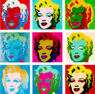
Another thing that inspired me when creating my idea was one of Andy Warhol's paintings:

I really like Warhol has taken close up picture and changed it so there are lots of little 'snap shots'. Although I do feel the colours are abit to bright and out there for my genre so I would just stick with natalistic lighting or black or white.
A also noticed a band called Stranded were inspired by Warhol and created their album cover based on that painting:

From looking at these things I came up with my own idea:

I really like this idea as this will show my cover stars personality, and my readers will feel like they know more about her. In the middle is the cover line as I feel its good to have a mix of text and pictures. In this draft I used the cover line "I'm no robot, I do what I want", although it may not stay with this, I want to stick with the same theme. The cover star is going to be talking about how they are not controlled by their record label like many pop artists, they are completely their own person and record the music they want to record. I feel this is a good topic as it has come to the surface more recently that many artists are told what to do or say by their record label and in fact have become almost like 'robots' and this shows that this artist is unique.
On the right side of my double page spread will be the main bulk of text, I have used a big S to start the sentence with artists name as I noticed this is what a lot of magazines tend to do. There will be short introduction into the article, explaining the basics on my artists, again after doing research I realised this is a common occurrence in magazines. The text will be then be a question and answer session split into two columns to make it easier to read.
Magazine name
I Know the name of the magazine is important as it needs to describe the magazine in a few words, once I have decided on a name I can start to create a logo for it.
I brainstormed some magazine names, and these are some of the ideas I came up with:
I brainstormed some magazine names, and these are some of the ideas I came up with:
- Just POP - This is simple and the reader will instantly know what the magazine is about. I do feel that this name may however suite a younger audience as it is quite basic and holds no real meaning.
- Beat - I like this one as its one word which is simple and easy to remember, also alot of pop songs have a strong beat so it links to the pop genre. The beat is an important part of a song and can completely change how a song sounds this reflects the fact I want my magazine to play an important part in the music industry as artists will want to appear in my magazine to influence their popularity.
- Popular - Popular describes pop music in one word and people often refer to pop music as popular music, this is good as it will inform the reader straight away the genre of my magazine. Also calling my magazine popular suggests that not only is my genre pop but my magazine is also popular which will encourage people to buy it.
- Modern - This word describes my magazine well as it will be full of up to date songs and artists, it is important the title of the magazine creates a good image in the readers mind and 'modern' suggest the magazine will be up to date and fresh. The thing about this name is that it does not relate to pop music, it is not clear that my magazine is a music magazine by the title.
- Pop Power - I like some aspects of this name as it suggests pop is powerful and has an impact on society, this is good as its a positive representation of my genre. However I do feel this is a bit cheesy and childish and would work with a younger target audience. I think a 16-30 year old would not buy this magazine as they think it will be for children/ younger teenagers.
Mock up of contents page
I was stuck for ideas for my contents page so decided I would spend some time looking at various contents pages for inspiration. My favourite layout was NME's contents page, there seemed to be an on going house style as a lot of their contents pages looked the same, this informs me that I need to create a strong distinctive layout.


I like the layout of this contents page as I think its straight forward and easy to follow, which is important as the contents informs the reader of where the articles are. I began to think about how I could use this contents as inspiration and I decided I would draw a mock up of a contents page I would use with this as inspiration.

I have kept some things similar but changed it to suit my style. I kept the logo of my magazine in the top left as this is where it will be on my cover so I want to create a house style. Also along the top in a date line, again similar to my front cover. Down the left hand side is the UK Top 20 chart, this was an idea I had already came up with and posted on my blog, I think it will make my pop magazine unique. The main image will be my cover star as I have noticed alot of contents pages also feature the cover star. Along the bottom will be 2 more pictures with the page numbers, this will give an insight into what the article will be about. Down the right hand side I have separated my articles into 4 sections, I noticed that most contents pages do this, the one above also does this. This helps the reader find particular articles easier.
The draft is in black and white as I have yet to decide a colour scheme, I will need to make my contents and front cover colour scheme link as this is a convention of magazines.
Wednesday, 21 November 2012
Publication plan
I created a publication plan to show how far I with the ideas for my magazine. Some things are more definate then other such as my target audience and price where as others are just draft ideas.


Subscribe to:
Posts (Atom)