Eval from hannahsweeney6
Thursday, 7 March 2013
Monday, 4 March 2013
final product
Front cover:

I have kept to a conventional layout of a front cover with the main cover line being in the centre and the other cover lines surrounding the cover star. I decided to do this because I wanted to make my cover star and main cover line the main focus of my cover as my research shows this is what my readers think is the most important thing. I edited out the background of my cover star image using Paint.Net because after looking at similar magazines to mine I noticed most of them did this. I created quite a few mastheads before deciding on this one as I wanted to be able to choose from a few ideas. I decided on this one in the end as I liked the fact it had colour in it, as this would enable me to have an on going colour scheme.
Contents:

This is probably my weakest peice in my opinion as I think the fonts are a bit too basic, so if I was to do this again I would spend more time finding apprioate fonts. I do think the layout resembles a real magazine, as I tryed to make it basic and easy to understand. I like the picture of the male singing as it is a real picture of a concert, I think this shows a varition to the other picutures in my magazine.
Double page spread:


I have kept to a conventional layout of a front cover with the main cover line being in the centre and the other cover lines surrounding the cover star. I decided to do this because I wanted to make my cover star and main cover line the main focus of my cover as my research shows this is what my readers think is the most important thing. I edited out the background of my cover star image using Paint.Net because after looking at similar magazines to mine I noticed most of them did this. I created quite a few mastheads before deciding on this one as I wanted to be able to choose from a few ideas. I decided on this one in the end as I liked the fact it had colour in it, as this would enable me to have an on going colour scheme.
Contents:

Double page spread:


I think this is the best part of my project, as I particually like how the photos came out. I like that the reader can see the different sides of her personality which will make the reader feel as though they know her. I kept the 'Selena' font the same as the front cover as I wanted to keep an on going theme. I kept the interview chatty and informal because my target audience are quite laid back people.
Friday, 8 February 2013
making my improvements
After having my peer assessment feed back I decided to change bits of my magazine accordingly


Another improvement mentioned was to add page numbers on my double page spread so I did this:


I changed the Selena to the red like suggested and I think it looks good as it adds more colour but still fits into the colour scheme. However I think having all the main cover line in red is a bit to much red and stops the Selena from standing out as much, so I decided I should change the "ill never play the game" to a different colour.

I changed the background to black because I wanted to keep in with my strong colour scheme (black gold and red) because this is a strong point of my magazine according to my peer assessment.
By changing the colours around the Selena will be easily read, which is important as my research shows that my target audience buy the magazine mostly because of the cover star.
Another improvement mentioned was to add page numbers on my double page spread so I did this:


I made the page numbers red to link in with the colour scheme and they are also quite small and in the corner of the page as this is how they usually are in magazines.
I changed the Selena font as it was slightly blurry and some of the S was cut off. This is the new font

I prefer this font as it looks more pop as its more simpler. After re looking at my old font I do think it had an urban feel.
I also changed the font on my double page spread as I wanted to keep a consistant font.
Thursday, 7 February 2013
first proof
This is the first proof of my project


We peer assessed each other work so that I could have feed back on what was good and areas I can improve on.
Good aspects:
The colour scheme was mentioned quite a lot they thought it was very strong and was good how I continued it on throughout the different pages.
Another thing that came up a few times was the pictures on the double page spread they thought they had good attitude and where unique. On a whole they thought the magazine was quite simple but worked well this way.
Improvements:
The only improvement I got was that they thought it was hard to read the Selena on the front cover, they suggested I could change it to red to fit in with the colour scheme.
Another small improvement is adding page numbers.
Tuesday, 5 February 2013
Tuesday, 29 January 2013
Reviewing spelling and grammer
As I am now coming to the end of making my magazine I decided I would go through and check spelling and punction and little things like that to ensure it was all correct as you very rarely see this type of mistakes in magazines.
After going through and making some changes I then asked a peer to look through it for me so they could also check if I had made any mistakes.
As far as I am aware all spelling and grammer should not be correct.
After going through and making some changes I then asked a peer to look through it for me so they could also check if I had made any mistakes.
As far as I am aware all spelling and grammer should not be correct.
Friday, 25 January 2013
interview layout
My second half of the double page spread is the interview, I wrote the interview out first then had to put it in columns for my magazine. I originally started putting each question on the page separately, this is how it looked:


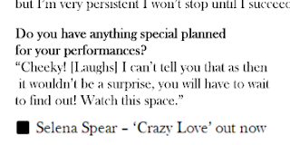


Although I hadn't finished putting all the text in I realised that the column down the middle will not be very big if I do it this way and probably wont be very straight, I also noticed that the questions where different sizes as I found it hard to get each question sized the same. So I decided instead I would put it in columns on word first then copy the text in

I now have a bigger column that it straight all the way down and the size of the text is all the same. However I did have to cut out some questions from the original interview I posted on here as it would not all fit in.
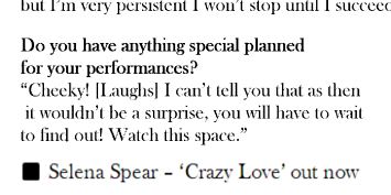
I noticed that at the bottom of interviews in magazines at the end of the interview they would state if interviewee has a current single/album/book/tv show out. Like this interview with Taylor Swift in Cosmopolitian

On my contents I have Selena 'Crazy Love' on my UK Top 20 so to link the two together I put it at the end of my interview.
Subscribe to:
Comments (Atom)