I particularly liked the images of Solange Knowles at the top in black and white as I thought this gave a hint into her personality and showed her fun side, I also thought this was a very unique idea and I had not see it before.
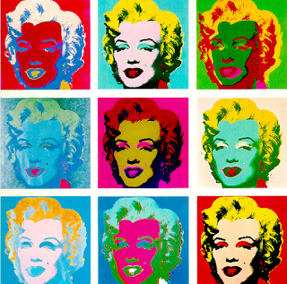
Another thing that inspired me when creating my idea was one of Andy Warhol's paintings:
I really like Warhol has taken close up picture and changed it so there are lots of little 'snap shots'. Although I do feel the colours are abit to bright and out there for my genre so I would just stick with natalistic lighting or black or white.
A also noticed a band called Stranded were inspired by Warhol and created their album cover based on that painting:
From looking at these things I came up with my own idea:
I really like this idea as this will show my cover stars personality, and my readers will feel like they know more about her. In the middle is the cover line as I feel its good to have a mix of text and pictures. In this draft I used the cover line "I'm no robot, I do what I want", although it may not stay with this, I want to stick with the same theme. The cover star is going to be talking about how they are not controlled by their record label like many pop artists, they are completely their own person and record the music they want to record. I feel this is a good topic as it has come to the surface more recently that many artists are told what to do or say by their record label and in fact have become almost like 'robots' and this shows that this artist is unique.
On the right side of my double page spread will be the main bulk of text, I have used a big S to start the sentence with artists name as I noticed this is what a lot of magazines tend to do. There will be short introduction into the article, explaining the basics on my artists, again after doing research I realised this is a common occurrence in magazines. The text will be then be a question and answer session split into two columns to make it easier to read.


No comments:
Post a Comment